The job description: one step, repeated patiently
A tutorial GIF exists for the question you've answered eleven times. It demonstrates one self-contained action (flip the setting, rename the layer, pull the branch) and then demonstrates it again, on a loop, while the person watching mirrors it on their own screen. No audio to unmute, no timeline to scrub back. Its entire value is that it keeps showing the step until the step sticks.
It fails at anything with branches. Six decision points and a config file want written docs with a video link. The GIF's territory is the single move that's faster to watch than to parse from a paragraph, and the tighter you scope it, the better it teaches.
Overlays here are text plus an optional watermark image, and text covers most teaching: up to three captions per GIF, in a clean brand-font style with a color picker or full meme Impact, parked at the top or bottom or dragged to wherever they should sit, and each can be timed so "step 2: pick the branch" appears exactly when step 2 happens. No arrows or stickers, so if a step truly needs a red circle, bake it in while recording. The text overlay page has the full caption rundown.
Get a recording that already teaches
With no voiceover, the cursor is the instructor, and it has one common failure: moving at your working speed, which is several times faster than a stranger can track. Hover, wait a beat, then click. Each pause becomes a readable rest in the final loop.
- macOS: Shift-Command-5 records a region straight to a clean movie file; QuickTime's screen recording does the same job.
- Windows: Game Bar (Win-G) captures the active window; OBS if you want a pinned region.
- Teaching something in a browser? The tool's own Record a Tab button captures another tab through the browser's share picker and drops the take directly into the editor, no separate app involved. It's desktop-only and records in real time, and since it grabs what's on screen, it's the convenient route rather than the frame-exact one. For web UI lessons, convenient is usually plenty.
- Quiet the frame: close stray tabs, mute notifications, and record a region rather than the whole monitor, so the pixels that survive are the lesson.
End the take with a second of stillness on the finished state. That still second is what lets the loop restart gracefully instead of snapping back mid-gesture, and it gives the viewer a moment of confirmation that the step worked.
From take to teachable loop
- Load the take. Drag the recording (MP4, MOV, WebM, MKV, M4V, AVI, whatever the recorder produced) onto the tool. Everything from here happens on your machine, so footage of an internal admin panel isn't traveling anywhere.
- Cut the search, keep the step. Trim off the part where you locate the menu; begin as the cursor commits to the target and stop one beat after the result appears.
- Crop where the eyes should go. 1:1 sits well in chat and docs, 4:3 fits a settings panel, 16:9 only when the whole window genuinely matters. Tight crops spare your viewer the scan across a 27-inch capture.
- Pace it with the frame rate. 10 to 12 fps reads calm for interface work and stretches each moment across more watch time, which is the direction a lesson wants.
- Protect the labels. Hold the palette up near 128 so menu text and field names survive; a tutorial with mushy labels is a riddle. Add a timed caption when the UI copy alone doesn't carry the step.
- Check the weight, export. The size readout follows your changes; land it at a few MB so the loop plays the instant someone opens the doc.
Pacing and the trim: where follow-ability is won
Two defects kill more tutorial GIFs than everything else combined: too fast to follow, and too blurry to read. Both get decided in the edit.
- Frame rate is a pacing control, not a quality one. At 10 to 12 fps every step lingers a little, which is precisely what following along requires. Reserve faster rates for content that's actually fast.
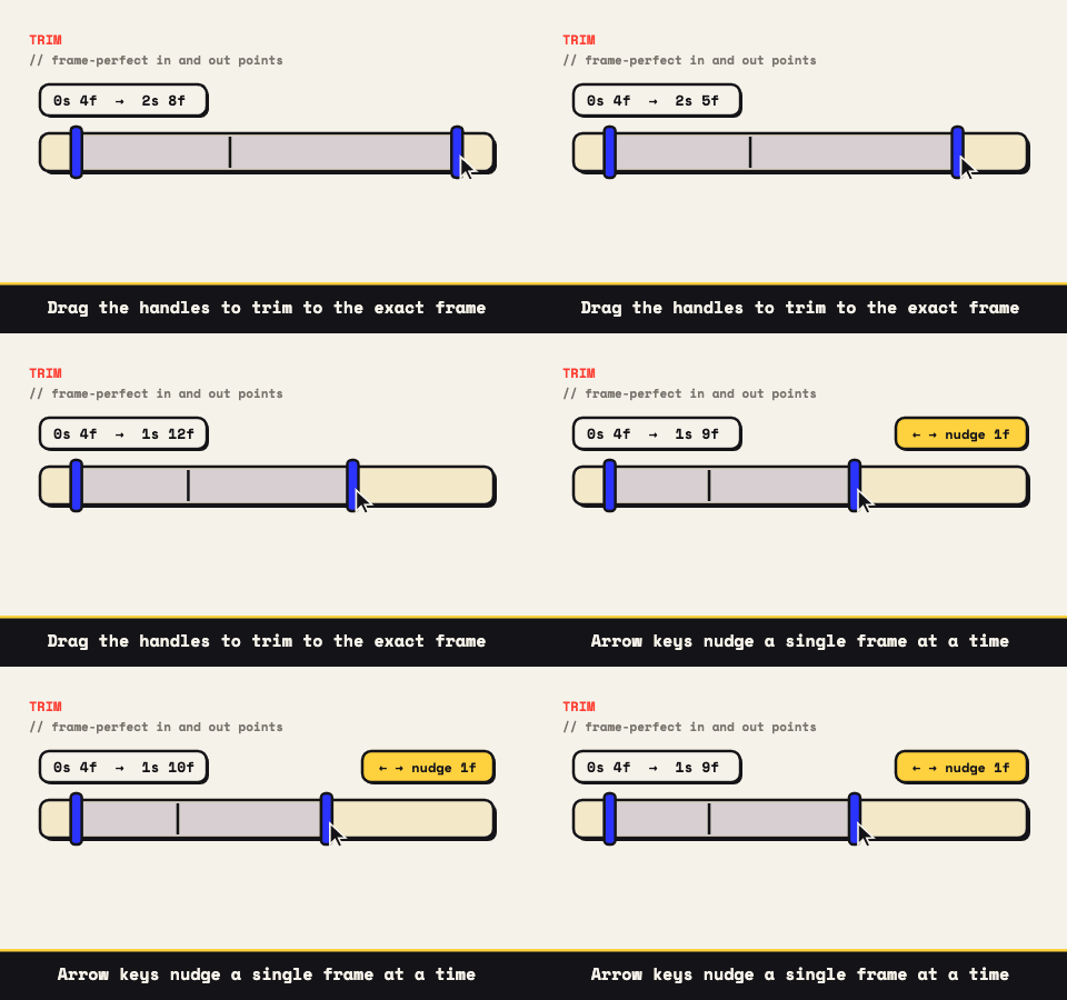
- Trim ends on matching stillness. When the last frame nearly matches the first, the repeat is invisible and the lesson reads as continuous. The cut points step frame by frame, so put them exactly on the quiet moments.
- Crop first, scale second. Shrinking a full desktop blurs the one menu that mattered. Cut down to the panel, then resize, and the surviving text stays sharp.
- Dithering earns its place on UI. It smooths the banding on gradients and soft shadows without spending extra palette, so screen content usually wants it on.
Anywhere the answer keeps coming up
The loop's advantage over a screen-recording link is that it plays where the question lives. Inline in a Notion page beside the written steps, in a help-center article, in the Slack onboarding thread, in a README next to the command it demonstrates. A link asks the reader to leave, load a player, maybe hit a login wall; the GIF is already moving by the time they've read the sentence above it.
And because the whole pipeline is local, the same workflow documents internal tools without a compliance conversation. The footage goes from your screen to your GIF with no stop in anyone's cloud.
Tutorials age the moment the interface moves a button, which is why the editor's project files earn their keep here. Save the .wtg once, keep it next to the recording, and when the UI shifts you re-record the take, drop both files back onto the tool, and the same trims and captions rebuild themselves around the new footage.