Two destinations, and only one of them is yours
Onboarding motion lands in one of two environments. Either the welcome sequence, where the file is an image tag inside somebody's mail client and the rendering rules were set in 2007, or inside the product itself: a first-run modal, an empty-state card, the help article a tooltip points at.
In the product you control the host, the caching, the breakpoint, and the exact moment the file loads. In email you control the bytes and nothing else. Build for the email first and the in-product version is a resize. Build for the product first and you will be rebuilding it on send day.
The welcome email is rendered by a word processor
Classic desktop Outlook, roughly the 2007 through 2019 versions, lays out mail with Microsoft Word's rendering engine. Word does not animate. It draws the first frame of a GIF and leaves it there. The new Outlook, Outlook.com, and Outlook mobile all animate normally, as do Gmail and Apple Mail, so this is a slice of your list rather than all of it, and you have no way to know which slice.
Design the still first, then. Frame one should show the finished state with its caption already on it, so a static reader still leaves knowing what the feature does. Then the numbers everyone quotes for a reason: around 1 MB or less, 600 to 640 px wide for a standard template, alt text on every image, and no assumption that the loop will ever stop, because it will not. The email guide goes client by client.
Inside the product, weight is a first-impression tax
A first-run modal is the single worst moment in a product's life to serve a six megabyte download. The user signed up ninety seconds ago, they are on whatever connection they have, and the first thing your software chose to show them is a grey rectangle filling in from the top. Budget 500 KB to 1.5 MB for anything that autoloads on a first screen, and lazy-load every loop below it.
The dials that get you there without visible damage: 12 to 15 fps is plenty for a pointer moving through an interface, 64 to 128 colors covers a flat product UI without banding the one gradient in your brand, and the width that matters is the width the element actually renders at. Export at that number, or double it for a high-density screen, and never at the width of your monitor. Squeezing a small file out of video works through the tradeoffs in order of payoff.
Nobody can rewind a GIF, and new users constantly try
This is the ceiling, and it is worth accepting before you commission a library of forty loops. A GIF has no scrubber, no pause, no speed control, and no way back to the half second somebody missed. It restarts on its own schedule. A new user who looked away during the third click gets to wait for the loop to come round again, which they will do roughly once before giving up.
So the rule is one behavior per loop. Not "set up your workspace". Instead: drag a card between columns. Invite a teammate. Connect the calendar. Three to six seconds each, each its own file, each captioned with the action it shows. A genuine six-step flow is a document with six loops in it, or a narrated video with a timeline. One long GIF pretending to be a tour is how onboarding content earns its reputation.
Where two beats really do belong together, the sequence panel will run up to ten clips into one output with hard cuts and a caption that spans them, previewed with Play edit before you commit. Useful for a two-part idea. Not a substitute for a tour. Combining clips into one GIF covers the mechanics.
Cut on the click, land on the result, then label it
Record the flow with whatever recorder you already have, or press Record a Tab in the drop zone and capture the running app straight into the editor without installing anything. Either way the trim decides whether the loop teaches. Start about half a second before the click and end about half a second after the result settles. A loop with no breathing room on either end reads as a stutter, and a stutter reads as broken software.
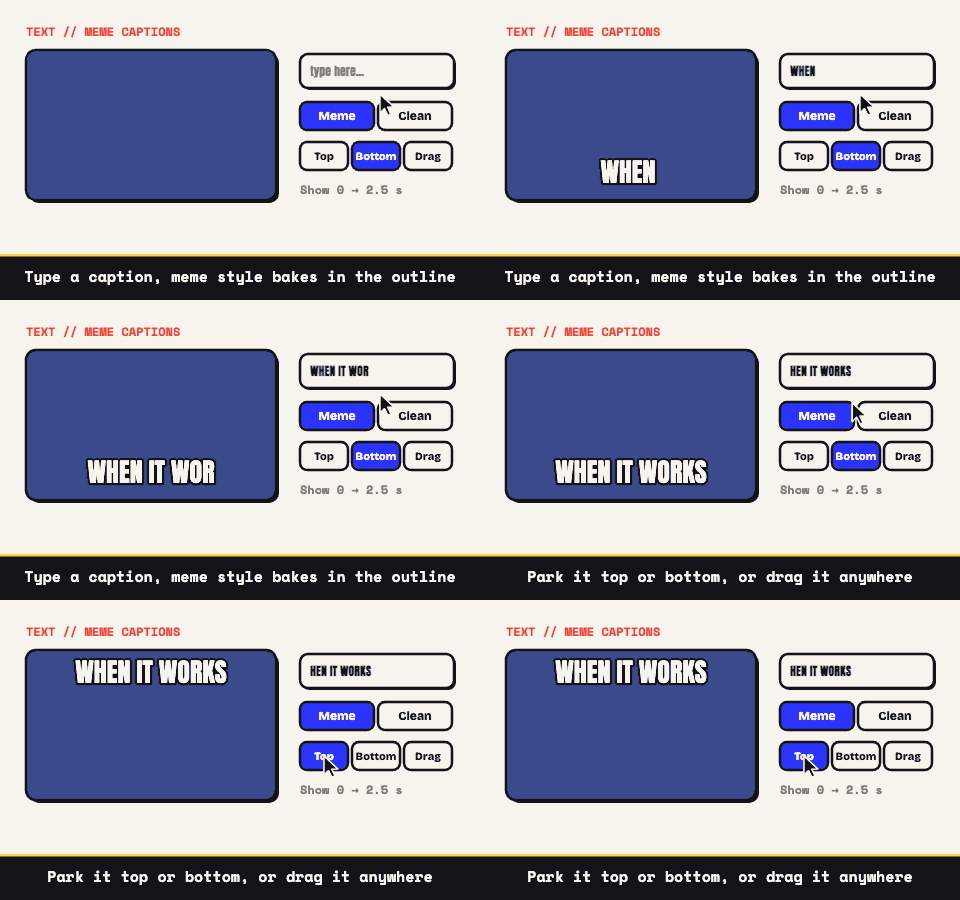
Two settings do more for comprehension than any compression dial. A short fade at the tail, so the restart reads as a restart rather than a jump cut. And one clean caption naming the action, timed to appear when the action does, so the loop still teaches for somebody skimming with the page half scrolled.